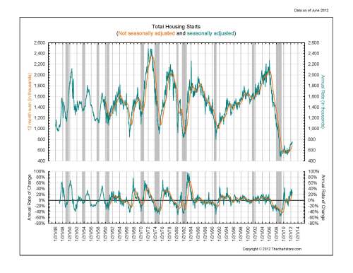
Occasionally we run into data, a quote, or a chart that explains more than we can ever say, especially for those fellow visual folks, such as myself. The attached chart is from The Chartstore and oddly, after reviewed this on a weekly basis for months, it finally hit me what it was showing.
In an attempt to most certainly shorten the time frame for your aha moment (haha) here are the high points that finally pushed me over the edge and into clarity:
- This chart commences in 1945, US resident population approximately 150 million
- Peak housing starts occurred in 1973-1974 time frame, just before the strongest recession in memory, at that time, US resident population 210 million
- Secondary peak housing starts occur in 2007 just missing the prior 1974 high of annual starts by 200k, US resident population 310 million (home ownership is smaller as a percentage at this time)
- 1974 Peak occurred in a 3 year time frame (trough to peak)
- 2007 Peak occurred in a 17 year time frame (trough to peak) …. no wonder everyone said it was different this time
- An 80% drop occurred from 2007 until the bottom in housing starts a few years later…..think of the implications (economic, employment, productivity, inventory) of an 80% drop !
Conclusion: Just like a wreck of any kind, there are multiple reasons for such an occurence and no one party is to blame especially given normal economic cycles which are here to stay and cannot be thwarted.
Have a Great Aha Monday!
JK
PS I am traveling out-of-town!
214-706-4300

